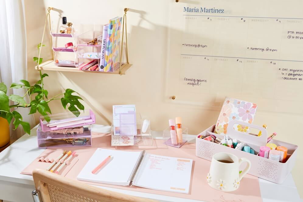
Desk Accessory Color Guide: Choose the Right Hue for Your Workspace
Share


Selecting the right color for your desk accessories isn’t just about aesthetics — color impacts our mood, focus, and productivity. Below is a curated guide to which colors work best in your workspace and recommended accessories for each.
🎨 Color-by-Color Recommendations & Suggested Products
-
Hightide Dark Green Desk Tray: Deep green brings calm and balance to your work zone — great for long hours & concentration.
Use for: desk tray for small items, papers, chargers.
Why: Green tones reduce visual strain and create a soothing backdrop. -
Annova Light Pink Rotating Mesh Organizer: Soft pink adds warmth and gentle energy — perfect if you want a friendly, inviting desk.
Use for: pens, scissors, small supplies.
Why: Pastel pinks subtly uplift the space without overpowering it. -
Marlon Harvest Gold Wire Ceramic Desk Organizer: Gold or brass tones bring a touch of luxury and sophistication.
Use for: specialty organizer, accent piece.
Why: Metallic accents elevate the workspace and give it a premium feel. -
Poppin Slate Blue Small Accessory Tray: Slate blue is stylish and professional — bridges the gap between cool & warm tones.
Use for: stacking small items, creating modular organization.
Why: Blue shades support clarity, calm, and are visually pleasing for focus. Chanty+1 -
Cherry‑Pattern Pink Desk Mat: A fun pattern accessory in pink tones for those who like personality in their workspace.
Use for: desk mat / surface layer.
Why: Pattern + color = mood boost + focal point. -
Sage Green Desktop Organizer: Sage green is muted, modern, and blends nature-calm into your desk.
Use for: pen holders, paper bins.
Why: Green and natural tones are recommended for home offices when you need clarity & calm. Ideal Home
🛠️ Tips for Applying Color Effectively
-
Pick one dominant color + one accent color to keep things cohesive.
-
Use neutral base (white, beige, grey) for desk surfaces + walls → add color through accessories.
-
Consider task type:
-
Creative work → brighter/warmer tones (pink, gold)
-
Analytical/long-focus work → cooler/softer tones (blue, sage)
-
-
Avoid too many bright colors at once. Too much variation = distraction.
-
Switch accessories seasonally if you like freshness — easy and inexpensive!
